
Warranty Administrators
Warranty administrators live and die by Loss Ratios, claims volume, and earnings curves.

Every day, administrators are forced to fly blind—waiting on spreadsheets, delayed actuarial reports, and third-party analyses that show up after the damage is done. By the time the insight arrives, the loss ratio has already blown through budget. Your products are mispriced. You are losing money.
Not anymore.
Upload your data and get instant, actuarial-grade visibility—no code, no IT, no waiting in line. Real answers, right now.
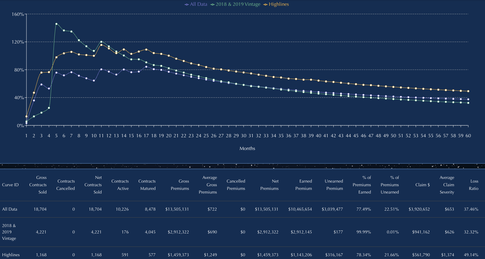
Our Curve engine turns contracts and claims into live, high-resolution visuals: Loss Ratio Curves, Frequency Curves, Cancellation Curves, and Earnings Curves that reveal what’s really driving performance. You’ll spot claim spikes, mispriced products, long-tail behavior, fast cancels, and problem dealers before they hit your month-end.
Segment by product, plan, agent, vehicle type, state—anything in your file. The intelligence you used to wait weeks for is now at your fingertips.
We never store your data—uploads are processed in-session only and permanently deleted after each use.
Loss Ratio Tool
INSTANT CLARITY ON PERFORMANCE—NO ACTUARIES, NO SPREADSHEETS, NO WAITING.
Loss Ratio Curves turn the hardest question for administrators into a real-time answer: Is this book making money—or bleeding—and why?
The Loss Ratio Tool gives warranty administrators immediate visibility into how the book is actually performing. Upload a simple Excel file and see loss ratios move in real time — no more waiting on internal teams or third-party actuarial reports.
The engine aligns earned premium, claims emergence, and tail behavior into one clean curve. You’ll see which products are profitable, which partners are pulling down margins, and where underwriting or pricing needs attention.
And the flexibility is built for operators. Run Loss Ratio Curves on any earnings method you use today:
- Rule of 78
- Reverse Rule of 78
- Straight-line / Pro Rata
- Your own custom experience curve
Switch methods instantly. Compare them side by side. Validate profitability assumptions in seconds—not weeks.
Quickly compare loss ratios by product, plan, agent, dealer, vehicle type, state, or any field in your file. Spot early warning signs fast: early-life spikes, rising claim severity, long-tail leakage, fast-cancel distortions, and mispriced segments.
If it is in your dataset, you can filter by it. Filter by anything: Product, Plan, Agent, Dealership/Group, State, Vehicle Make/Model/Year, Vintage, and more.
Loss Ratio Curves give administrators the one thing they’ve never had: real-time control over the number that runs the entire business.
DO YOU WANT TO KNOW?
- Does Pro Rata, Rule of 78, or Reverse Rule of 78 produce higher earned premium for my book?
- How do loss ratios change when I switch to a custom experience curve?
- Which partners—agents, dealers, states—are quietly dragging down profitability?
- Am I losing money on Windshield in Colorado this year?
- Are my claims costs rising, and which segments are driving it?
- Have the process improvements in my claims department actually improved loss ratios, or not?
If the data’s in your file, the answers are just a few clicks away.
Claims Frequency Curves
Instant visibility into claim patterns—no code, no formulas.
The Claims Frequency Curve tool builds Earnings Curves and Claim Frequency Curves in seconds, using your raw data—by count or dollar amount. This warranty administrator analytics tool quickly track how claims emerge over time—month by month—aligned by origination date.
Use the output to build an Earnings Curve and support accurate Loss Ratio calculations, reserve planning, and pricing.
Easily compare claims frequency by product type, contract term, agent, administrator, vehicle, or any field in your file.
Identify early spikes, long-tail claims, and partner-level differences in just a few clicks.
Minimum required columns:
- Origination Date
- Origination Amount ($)
- Claim Date
- Claim Amount ($)
- Contract Term
- Date of Data Download
Have more fields? Great. Filter by anything: Product, Plan, Agent, Marketing Client, State, Vehicle Type, Finance Company, and more.
It has never been easier to create an earnings curve based on your experience.
DO YOU WANT TO KNOW?
- How can I prove that one of my dealerships is putting through a high volume of early claims?
- Should the earnings curve for loss ratios change based on claim frequency or timing?
- When do most claims occur—early in the contract, or later?
- Which products or plans are generating the most frequent claims?
- How do claims frequency patterns differ across states or vehicle types?
If the data’s in your file, the answers are just a few clicks away.
Easy to Use Claims Frequency Curve
- Upload your Excel file
- Choose your filters
- View the graph instantly
- Download your results
No coding. No formulas. No data science degree required.
Just fast, clear answers—ready in seconds.
CANCELLATION CURVES
INSTANT VISIBILITY INTO CANCELLATION TRENDS—NO CODE, NO FORMULAS.
The Cancellation Curve is a warranty administrator analytics tool that builds Cancellation Curves in seconds, using your raw data—by dollar amount or contract count.
Easily track and compare cancellation behavior by product type, term, agent, administrator, finance partner, or any other field in your file.
Quickly evaluate which marketing clients are driving higher or lower cancellation rates—with just a few clicks.
Minimum required columns:
- Origination Date
- Origination Amount ($)
- Cancel Date
- Cancellation Amount ($)
- Contract Term
- Date of Data Download
Have more fields? Even better. Filter by anything: Marketer, Product, Plan, State, Agent, Finance Company, Vehicle Type, and beyond.
DO YOU WANT TO KNOW?
- Which marketing partners have higher cancellation rates?
- Are my marketing partner cancellation rates changing due to finance term, down payment, or product?
- Which products flat cancel fastest?
- What’s the cancellation rate at Month 6 versus Month 12?
- Are longer-term contracts or higher-priced plans more likely to cancel?
- Which finance partners are associated with higher cancellation risk?
If the data’s in your file, the answers are just a few clicks away.
Easy to Use
- Upload your Excel file
- Choose your filters
- View the graph instantly
- Download your results
No coding. No formulas. No data science degree required.
Just fast, clear answers—ready in seconds.
PEOPLE CURVES
INSTANT VISIBILITY INTO WORKFORCE RETENTION AND ATTRITION — NO CODE, NO FORMULAS.
The People Curve is a workforce analytics tool that builds People Curves in seconds, using your raw employee or contractor data—by headcount or weighted metrics.
Instantly visualize how long people stay, when attrition accelerates, and how retention differs across roles, teams, locations, or employment structures.Quickly compare workforce stability by department, role type, hiring cohort, manager, or geography—without waiting on HR analytics or custom reporting.
Use People Curves to identify where retention is improving, where churn is structural, and where workforce risk is quietly compounding.
Minimum required columns:
- Employee ID
- Start Date (Hire or Engagement Date)
- End Date (Termination or Exit Date, if applicable)
Have more fields? Even better. Filter by Role or Employee Type, Department or Team, Employment Class, Manager, Location, Hiring Cohort, Shift, Cost Center, Tenure Band, or beyond.
If it’s in the workforce data, it’s on your screen—instantly.
DO YOU WANT TO KNOW?
- Which teams or roles experience the fastest attrition?
- How retention differs by hiring cohort or start period?
- Where workforce churn accelerates—Month 3, Month 6, or Month 12?
- Whether certain managers or locations drive higher turnover?
- How contractor retention compares to full-time employees?
- Where workforce stability is improving—or quietly deteriorating?
If the data’s in your file, the answers are just a few clicks away.
Easy to Use
- Upload your Excel file
- Choose your filters
- View the graph instantly
- Download your results
No coding. No formulas. No data science degree required.
Just fast, clear answers—ready in seconds.
Benefits
TIME
Build a curve with filters in under 60 seconds
Skip the 10+ hours it takes to do it manually in Excel
ACCURACY
Remove human error with automated calculations
Trust every curve—logic is transparent and repeatable
FLEXIBILITY
Filter on any field in your dataset
Works with your structure—no need to reformat files