Claim Frequency Curves

Claims Curves, Lightning Fast

See how behavior unfolds in real time. Our no-code Claim Frequency Curve tool reveals claims frequency and severity. It turns raw data into visual insights anyone can understand—no code, no formulas, just clarity.

Build and explore your own curves in three simple steps:

Curve creation demo

Curve builder screenshot

  1. Upload your Excel file
  2. Choose your data settings (date fields and groupings)
  3. Use Curve Builder to filter columns (such as product, term, state) and reveal trends

If you can use a spreadsheet, you can use Dark Sky Data.

We never store your data—uploads are processed in-session only and permanently deleted after each use.

Easy to Use Claims Frequency Curve

  • Upload your Excel file
  • Choose your filters
  • View the graph instantly
  • Download your results

No coding. No formulas. No data science degree required.

Just fast, clear answers—ready in seconds.

Use Cases for the Claim Frequency Curve Analytics Tool


Curves Done Right


Build powerful claims curves in seconds—filter by product, term, down payment, or origination month, and more to uncover what’s really driving your business.


Private Equity Firms


Speed up diligence and increase accuracy—Claim Frequency Curves let you visualize frequency, severity, and customer behavior over time, with filters across any attribute in your dataset.


Benefits

TIME

Build a Claim Frequency Curve with filters in under 60 seconds

Skip the 10+ hours it takes to do it manually in Excel

ACCURACY

Remove human error with automated calculations

Trust every curve—logic is transparent and repeatable

FLEXIBILITY

Filter on any field in your dataset

Works with your structure—no need to reformat files

How It Works

Step 1: Upload

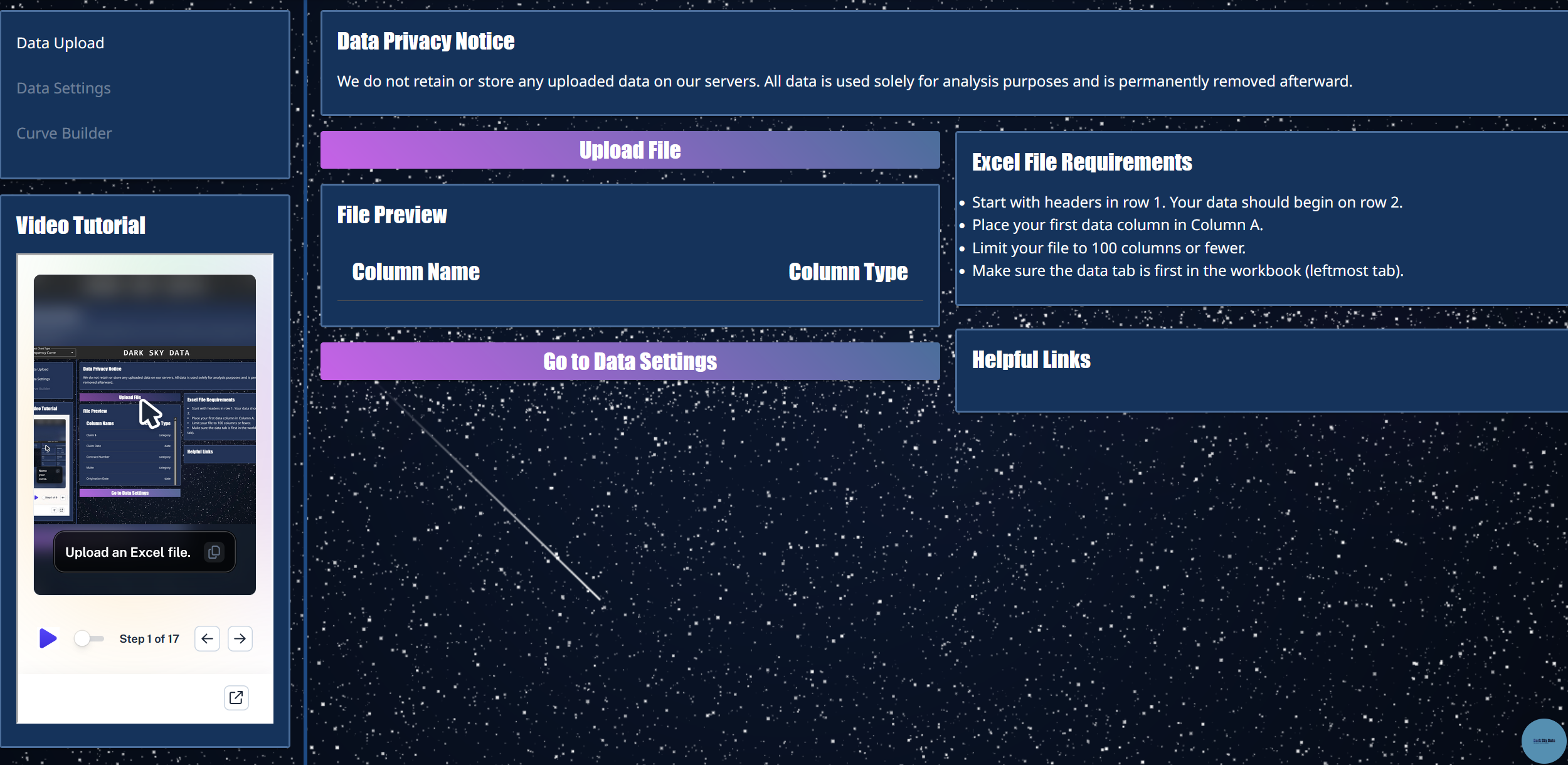
Drop in your Excel —no formatting required.

Big files? No problem. Just make sure the data is in the first tab.

Not sure what to upload? Use our example data.

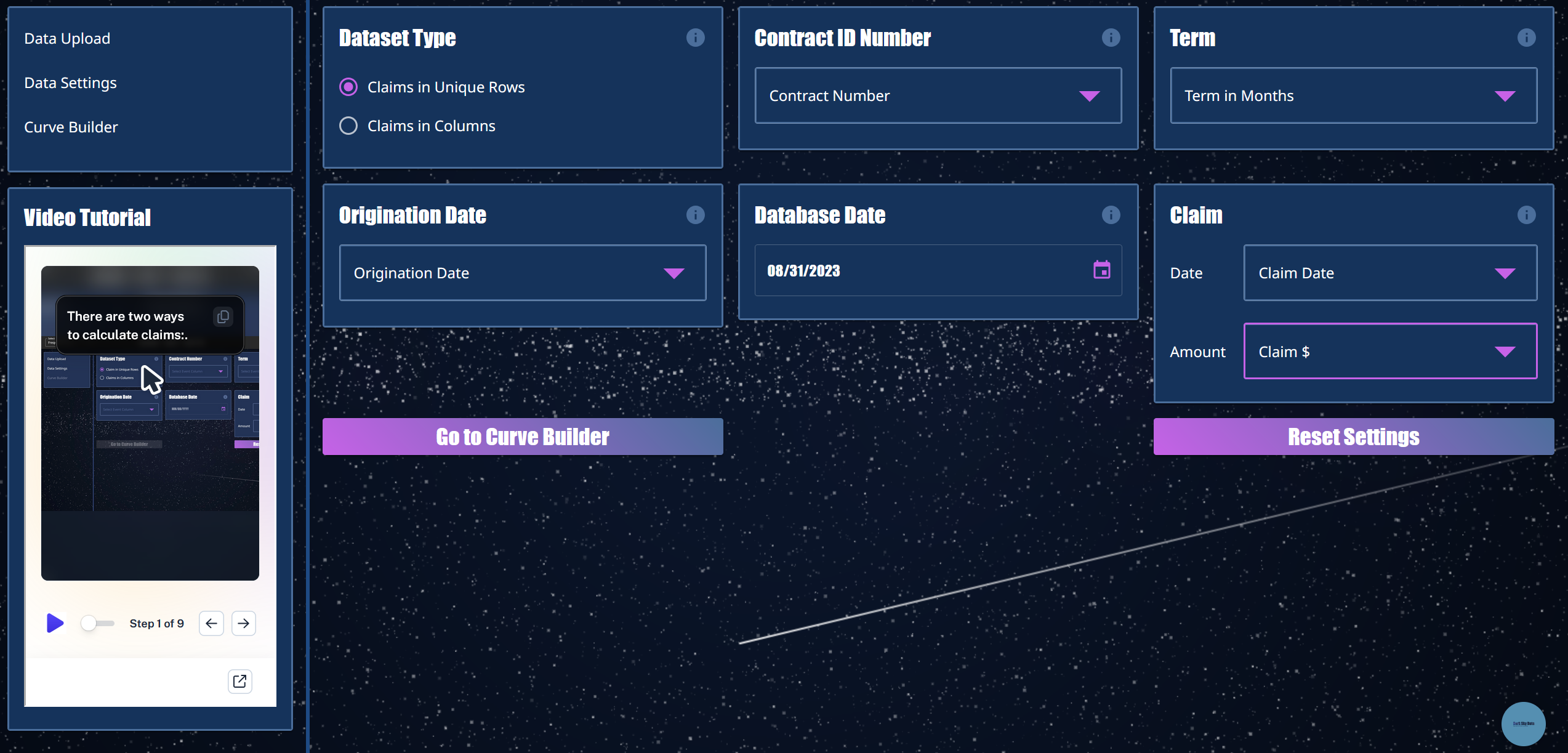
Step 2: SET FIELDS AND FILTERS

Turn any column into a filter.

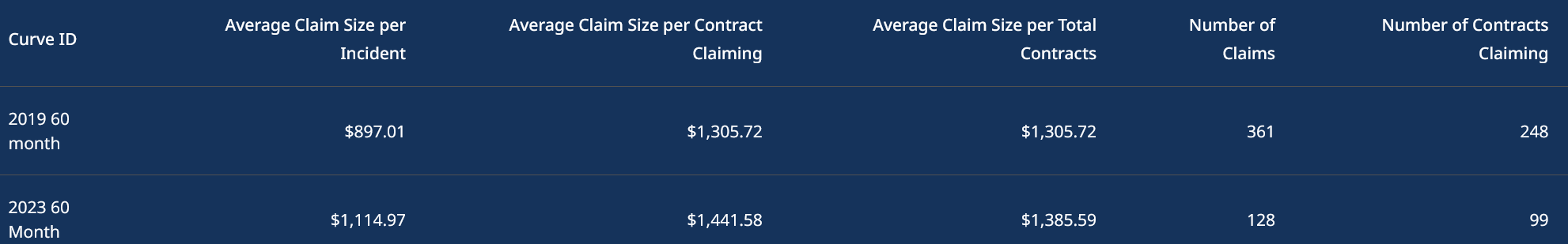
Compare cancellations by lender, state, product—even Ford F-150s in Texas vs. Camrys in California.

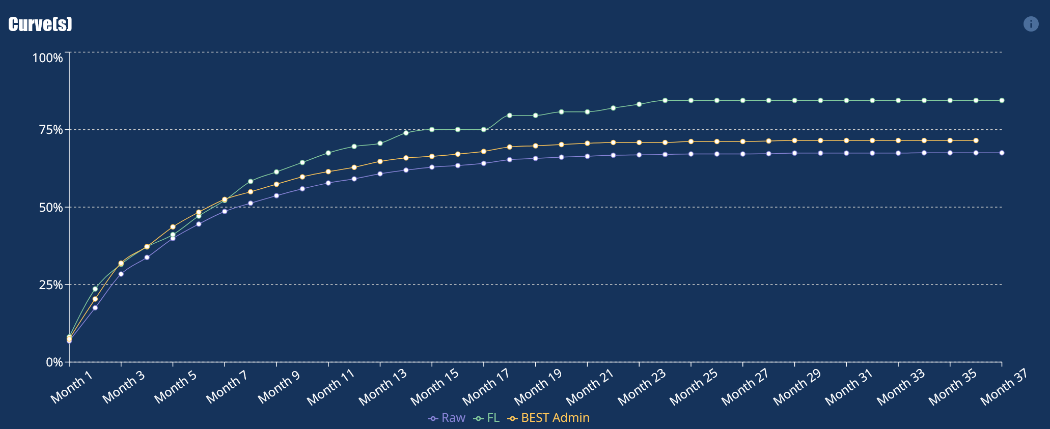
Step 3: Build Curves

The curve builds itself—automatically and instantly.

Hover to reveal exact values with interactive tooltips.

Compare up to five filtered curves side-by-side, ready to explore or export.

Ready to Unlock the Power of Your Data with our claim frequency curve analytics tools?
We can transform your data into a competitive advantage.

Frequently Asked Questions

What is a Claim Frequency Curve Analytics Tool?
A Claim Frequency Curve Analytics Tool lets you visualize claims play out over time by aligning all contracts to a shared starting point: Month 1. This means that a contract starting in June 2023 and another in November 2024 both begin at Month 1 on the curve, allowing you to compare cohort behavior regardless of calendar date. You don’t need any code or formulas—just upload your file and go.

Who should use this tool?
Business users in warranty administration and private equity rely on this tool to get fast, clear answers from raw contract or behavioral data—without waiting on analysts or IT support.

What kind of data do I need to get started?
You'll need an Excel file that includes a start date and an event date for each claim. Claims can be stacked within the same row or across multiple rows. As long as they share a contract number, their metrics will be grouped together To refine your analysis, you can also include filters like product type, geography, or partner.

Why is it so hard to build claim frequency curves in Excel?
Excel wasn’t built for scalable cohort analysis. When you work with large datasets, creating claim frequency curves demands complex formulas, helper columns, and constant rework—especially when filtering by variables like product, partner, or geography. Each time you want a new view, you have to rebuild the logic from scratch.

What makes this claims frequency curve analytics tool different?
Our tool eliminates the manual effort. Just upload your file, choose your filters, and instantly visualize how behavior unfolds across cohorts. It runs fast, handles high-volume data with ease, and avoids the crashes and lag you often get with Excel.

Do I need a data science background to use it?
Not at all. We built the Claim Frequency Curve Analytics Tool for non-technical users. Whether you're in marketing, finance, or due diligence, you can drag, drop, and filter your way to insights—no data science degree or SQL skills required.