
Why Cancellations Matter More Than You Think
If you’re selling home warranties, you’ve felt the pain of early cancellations. They wipe out your profit, spike your reserve requirements, and steal all the cash you need to grow. That’s where the Home Warranty Cancellation Curve comes in.
 What is a home warranty cancellation curve? A Home Warranty Cancellation Curve tracks how policies cancel over time, helping marketers understand retention trends. It shows when customers are most likely to cancel and identifies patterns by channel, sales rep, pricing structure or product type.
Now picture this: your average CPA is $600—and you don’t see a return until at least Month 6. When customers cancel early, it doesn’t just hurt—it can derail your entire campaign.
And the impact goes deeper than just lost margin. Your payment plan provider is paying attention. They base your funding terms on historical cancellation behavior. If your curve drops fast in the first few months? Expect smaller checks—or worse, an urgent demand for additional cash to shore up your reserve.
Fewer early cancellations = lower reserve = more cash upfront.
So… don’t you want to know what’s driving the cancels?
-
Is it your mark-up?
-
Is it Brandon in the call center?
-
Is one lead provider performing poorly?
-
Is there product that’s spiking?
The Home Warranty Cancellation Curve shows you where the losses are hiding—so you can fix them, prove it, and get paid more.
WHAT IS A HOME WARRANTY CANCELLATION CURVE?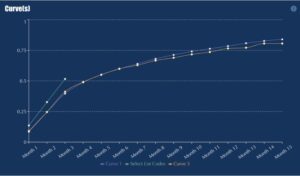
A Home Warranty Cancellation Curve tracks how policies cancel over time, helping marketers understand retention trends. It shows when customers are most likely to cancel and identifies patterns by channel, geography, or product type.
Most marketers focus on how many cancellations happened this month. But the Home Warranty Cancellation Curve goes deeper—it shows when contracts cancel, normalized across start dates. Whether a policy began in February 2023 or September 2024, they’re both aligned to Month 1 on the curve. That means you can track cancellation behavior side-by-side, no matter when the sale happened.
WHY ARE MY FLAT CANCELS SO HIGH?
Flat cancels—when customers cancel before the policy even goes active—are often a sign of poor lead quality, aggressive sales tactics, or broken onboarding. Use cancellation curves to identify lead sources, reps, or offers that correlate with high flat-cancel rates. Then adjust your targeting, sales scripts, or confirmation workflows to improve buyer intent and follow-through.
HOW CAN I DETERMINE WHAT IS CAUSING MY CANCELLATIONS?
Start by filtering your data. Compare vintages (month of origination), sales reps, finance companies, lead source - whatever you upload can be filtered. Then look for patterns: Are certain sales reps consistently tied to high Month 1 cancels? Do some lead sources result in faster drop-off? Segment by down payment size, term length, or monthly payment. Cancellations are rarely random—dig into the outliers and laggards to uncover what’s driving early churn.
HOW OFTEN SHOULD I REVIEW MY CANCELLATION DATA?
Every week. Cancellation patterns can shift quickly, especially with flat cancels. Weekly reviews let you stop problems in their tracks—like if a single sales rep is driving early churn with overly aggressive tactics. The sooner you spot the spike, the faster you can fix it.
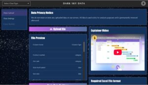 Step 1: Upload
What data is required to create a cancellation curve?
You need contract-level data: sale date, cancellation date (if any), and term. Just upload a spreadsheet—we handle the rest.
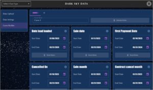
Step 2: SET FIELDS AND FILTERS
Turn any column into a filter: lead provider, finance term, down payment, product, call center agent - you upload it, you can filter.
Step 3: Build Curves
The curve builds itself—automatically and instantly.
Hover to reveal exact values with interactive tooltips.
Compare up to five filtered curves side-by-side, ready to explore or export in Excel.